One of the best ways to evaluate how a classifier performs is through an ROC curve. To understand what an ROC actually evaluates and how it evaluates it, we can create one ourselves.
Logistic Regression predictor models return binary values (0,1), in which the standard default threshold is 0.5. 0 - 0.5 values are interpreted as the negative class and 0.5 - 1 values are predicted as the positive class.
The function behind an ROC curve is formulated in the following way;
1 - Sort the probability instances made by the predictor model in increasing order.
2 - Then, for every instance;

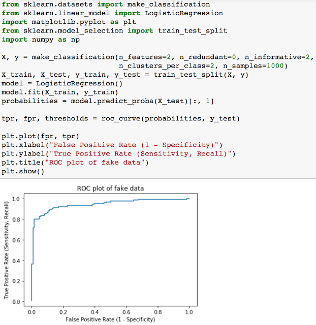
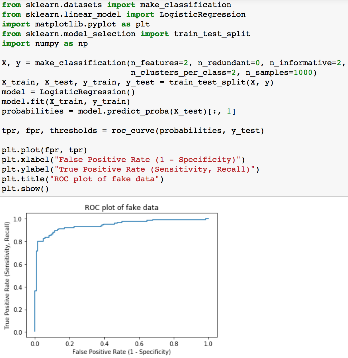
And so lets try using this function on a fake dataset from the sklearn module.


Logistic Regression predictor models return binary values (0,1), in which the standard default threshold is 0.5. 0 - 0.5 values are interpreted as the negative class and 0.5 - 1 values are predicted as the positive class.
The function behind an ROC curve is formulated in the following way;
1 - Sort the probability instances made by the predictor model in increasing order.
2 - Then, for every instance;
- set the threshold value to be that instance
- set all the values above the threshold to the positive class
- calculate the True Positive Rate, append it to a list of all TP rates
- calculate the False Positive Rate, append it to a list of all FP rates
3. Plot the TP rates list again the FP rates list.
If you don't know what the True Positive rate is, find it below
number of true positives / number of positive cases
in which the number of true positives is the number of correctly predicted positives
in which the number of true positives is the number of correctly predicted positives
And the False Positive rate is
number of false positives / number of negative cases
in which the number of false positives is the number of incorrectly predicted positives
number of false positives / number of negative cases
in which the number of false positives is the number of incorrectly predicted positives
The steps I wrote above simulated the pseudo code. A true ROC function would look like the one below.

And so lets try using this function on a fake dataset from the sklearn module.
Using our own data
The data we will be using is admission data on Grad school acceptances. The features of the dataset are
- Admit: whether or not the applicant was admitted to grad. school
- GPA: undergraduate GPA
- GRE: score of GRE test
- Rank: prestige of undergraduate school (1 is highest prestige, ala Harvard)
We will use the GPA, GRE, and rank of the applicants to try to predict whether or not they will be accepted into graduate school. But before we get to predictions, we should do some data exploration.

The pandas describe method shows us various measurements such as the standard deviation and mean for each feature of the dataset.
We can also use the pandas `crosstab` method to see how many applicants from each rank of school were accepted. You should get a dataframe that you can automatically plot as shown below.

It looks like the rank (or prestige) of a school that the applicant went to linearly correlates with acceptance numbers.
Next, we can look at the distributions of the data. What does the distribution of the GPA and GRE scores look like? Do the distributions differ much?

The distributions of GPA and GRE actually look quite similar, possibly normally distributed slightly skewed to the left (negative skew) centered around the means of GPA and GRE computed above. And for GPAs there is an anomolous bump near 4.0s.
Unbalanced Classes
When dealing with classification models, you always have to check and see if the classes are unbalanced. What percentage of the data was admitted? What percentage was not? This could create a substantial problem and many forget to check for it.

Classes aren't too imbalanced so you should be fine. When dealing with data where the label could potentially be something that is biased one way or the other (such as acceptance, fraud, signups, anything where one label is more preferential to the other or deals with some measure of "success") you should verify. Actually you should most always verify.
Predicting Admissions
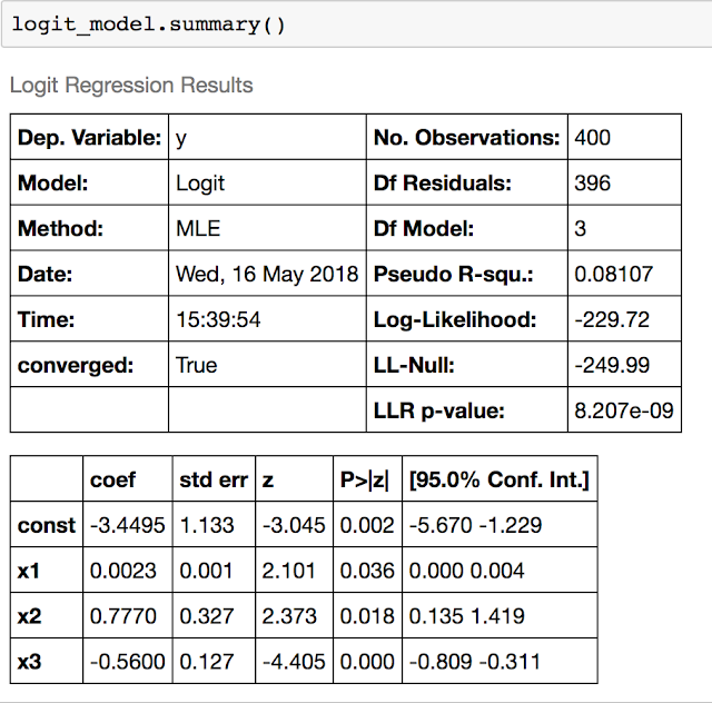
Now we're ready to try to fit our data with Logistic Regression. Use statsmodels to fit a Logistic Regression.

Use the `summary` method to see your results. Look at the p-values for the beta coefficients. We would like these to be significant. Are they?

Note that the p-values are all smaller than 0.05, so we are very happy with this model. Once we feel comfortable with our model, we can move on to cross validation. We no longer will need all the output of statsmodels so we can switch to sklearn.

Note that the accuracy and precision are pretty good, but the recall is not.
The `rank` column is ordinal where we assume an equal change between ranking levels, but we could also consider it to be more generally categorical. Use panda's 'get_dummies' to binarize the column.

Compute the same metrics as above. Does it do better or worse with the rank column binarized?

It seems to perform worse
Lets try and make a plot of the ROC curve using the function we defined in the beginning.
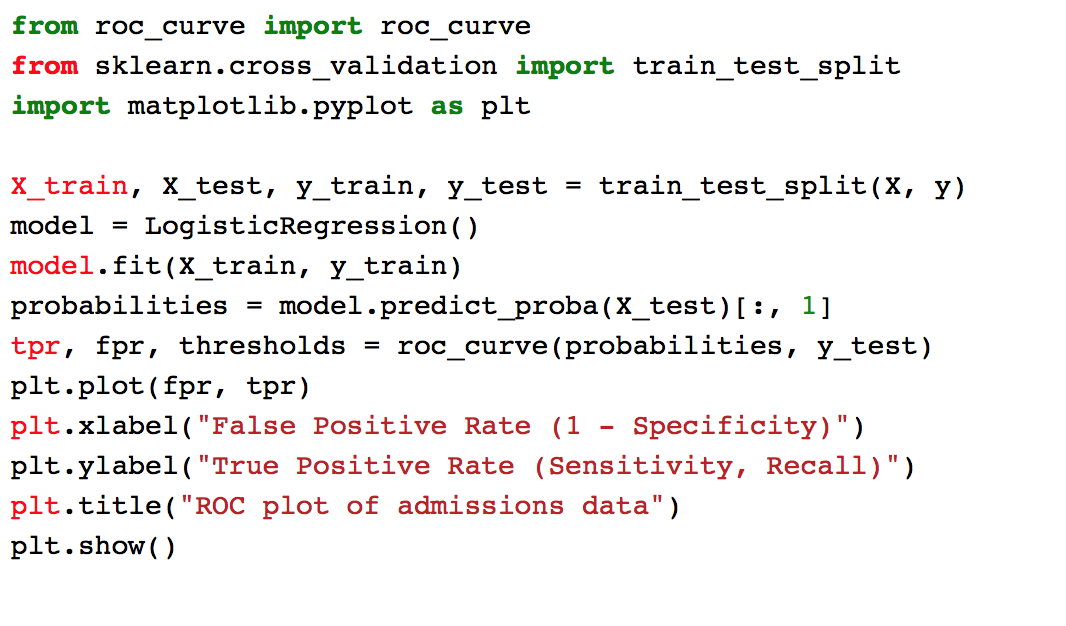

Now looking at the ROC curve above, do you think it's possible to pick a threshold where TPR > 60% and FPR < 40%? What is the threshold?
As a matter of fact we can. The answers may vary, but I predict roughly to be a TPR of 62.5% and FPR of 33.8% with a threshold of 0.3617.